Branding Redesign
Topel’s towing
and repair
The owners of Topel’s Towing and Repair came to us looking to update branding for their 70 year old family towing business. It hasn’t changed much since the establishment of the business.
Company Founded
September 1948
Lake Mills, Wisconsin
Business
Towing and Car Repair
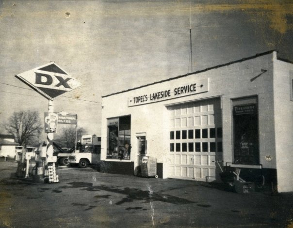
Business History
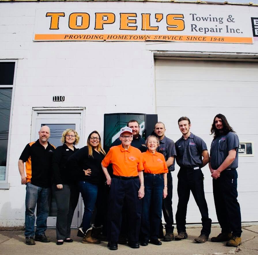
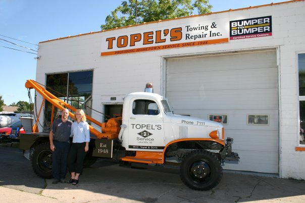
In September, 1948, Clifford Topel and his brothers, father and other relatives built a repair facility for their family farm on the south end of Lake Mills. It wasn’t long before Topel’s Lakeside Service was offering repair services and towing to farmers and motorists throughout the state of Wisconsin. On January 1, 2003, Clifford and Violet’s son Dan, and his wife, Tara, formed Topel’s Towing & Repair, Inc. The current facility has expanded from three bays to six.
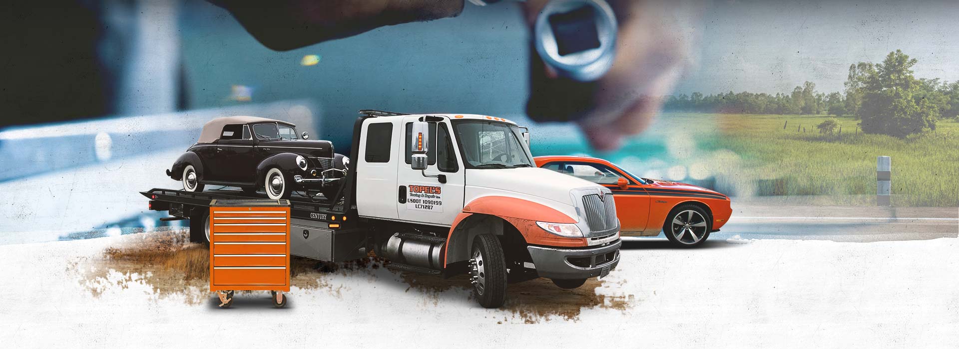
The owners of Topel’s Towing & Repair wanted to honor the rich heritage of 3 generations of business while still appealing to today’s customers.
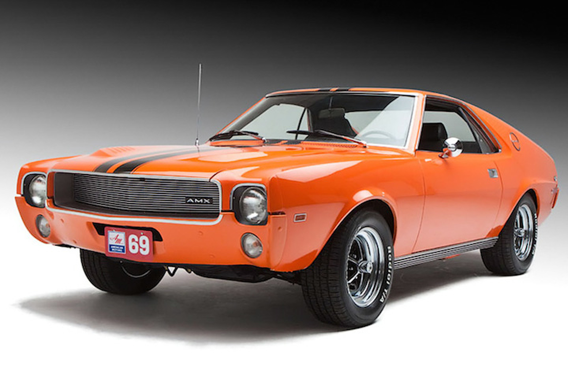
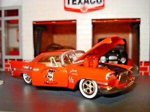
They wanted to use the well-renowned orange colors used by Ford, AMC and Chrysler in the 1960’s.

They also wanted to use a font similar to the original typeface used in the early years of the business.
What we’ve done so far for them
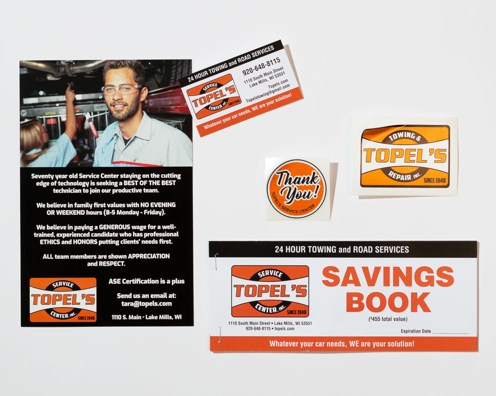
Cream City Marketing embraced the project and developed a new, vintage look for the Topel logo. Since then, we have used the basic branding foundation to produce a series of printed materials that have been well-received by Topel’s customers.
We recently extended branding basics to a postcard used at a recent recruiting fair.
Related projects